Once you've created a menu, a module was created and named the same as the name of the menu. This is mainmenu module (mod_mainmenu), it will display a Menu (with many Menu Item) on the Front Page.
- Log in to the Joomla! back-end.
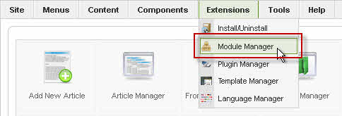
- Select the Module Manager from the Extensions drop-down menu.

- In the Module Manager, click on the Module's Title, or click the module's checkbox, and click on the Edit icon in the toolbar.
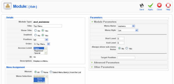
- In the Module: Edit click, all Modules have two sections that are the same: Details and Menu Assignment. The Parameters are different for each Module Type. Read more about: How to display module on selected page only?
Module Parameters
- Menu Name. The name of the Menu created in the Menu Manager screen. The default is "mainmenu". Note that you can have more than one Menu Module with the same Menu Name specified here (for example, if you are using Start and End Levels).
- Menu Style. The style of the menu. The options are as follows:
- List. Joomla! 1.5 List style. This is the style used by the menus in the Sample website.
- Legacy Vertical. Compatible with Joomla! 1.0 vertical style.
- Legacy Horizontal. Compatible with Joomla! 1.0 horizontal style.
- Legacy Flat List. Compatible with Joomla! 1.0 flat list style.
- Start and End Levels
Start and End Levels can be used to display different parts of one menu at different locations. For example, say you have one Menu with three levels as follows:
- Menu Item 1
- Menu Item 2
- Menu Item 2.1
- Menu Item 2.1.1
- Menu Item 2.1.2
- Menu Item 2.2
- Menu Item 3
Using Start Level and End Level, you could show this one Menu as three different small menus on your pages. To do this, you would:
- Create a "Main" menu with a Start Level of 0 and End Level of 1. This Module would display on all Menu Selections.
- Your "Middle" Menu Module would have Start Level of 1 and End Level of 2. It would only display Menu Items 2.1 and 2.2. It could be placed at a different Position than the "Main" menu and might only display on Menu Selection pages for Menu Items 2, 2.1, 2.1.1, 2.1.2, and 2.2.
- The "Third" Menu Module would have Start Level of 2 and End Level of 3, so it would only display Menu Items 2.1.1 and 2.1.2. It could be placed at a different Position from the other Menu Modules. It might only have a Menu Assignment for the Menu Items 2.1, 2.1.1, and 2.1.2.
- In this way, you can have one large, multi-level Menu but break it up into separate Modules. Also, doing a Menu in this manner has the advantage of making the Breadcrumbs Module display in a hierarchical manner.
- Start Level. Optional level to start the display of the Menu. Default is 0 for the Top Level.
- End Level. Optional level to end the display of the Menu. Default is 0, which will display all levels of the menu.
- Always show sub-menu Items. Whether or not to show sub-menu items when the parent is not active. If "No", a sub-menu Item will only display when the parent Item is clicked. If "Yes", sub-menu Items will always display in the menu.
- Target Position. Optional Javascript values, in pixels, to position a Popup window (for example, "top=50,left=50,width=200,height=300"). This is used in some templates to specify the location of drop-down or pop-up menus
Advanced Parameters
- Show Whitespace. Whether or not to show whitespace in the rendered XHTML. Whitespace includes spaces, tabs, newlines, and other formatting characters that don't affect the XHTML content. Note that this setting does not affect the appearance of the page. It only affects the appearance of the XHTML source code (for example, if you look at the source code from your browser).
- Caching. Use Global/No Caching. Whether or not to cache the content of this Module. A setting of "Use Global" will use the Cache Settings from the Global Configuration screen.
- Menu Tag ID. Optional ID attribute to be attached to the root UL tag of the Menu.
- Menu Class Suffix. Optional suffix applied to the CSS class of each Menu Item. This allows for Menu Item styling.
- Module Class Suffix. A suffix applied to the CSS class of the Module. This allows you to create customized CSS styles that will apply just to this module. You would then modify the "template.css" file of your template to apply styling to this new class.
- Enter this parameter with a leading space to create a new CSS class for this module. Enter the parameter without a leading space to change the CSS class name for this module.
- See the tutorial Using Class Suffixes in Joomla! 1.5/1.6 for more information.
- Maximum Menu Depth.
Other Parameters
- Show Menu Images. Whether or not to show Menu Images for the Menu Items.
- Menu Image Alignment. Whether to align the images to the left or the right.
- Menu Image Link. Whether or not to have the image be a link to the Menu Item.
- Expand Menu. Whether or not to expand the menu so that all sub-menu items are always visible.
- Activate Parent. Whether or not to set the ID's of the parent Menu Items as active when a sub-menu choice is activated.
- Full Active Highlighting. Whether or not to enable activation of the Link - Article and Link - URL. Note that setting this to "Yes" can cause the loss of XHTML compliance if more than one item is active.
- Indent Image. What image will be shown for each indented sub-level of menu item. Options are:
- Template. The Template will control the indenting images.
- Joomla! default images. Joomla! default images for indenting will be used.
- Use Parameters Below. Image file for each level 1 - 6 will be as indicated in the values below.
- None. Images will not be indented.
- Indent Image 1 - 6. Select an image file from the drop-down list box for each of the sub-levels 1 - 6. The images are selected from the "images/M_images" folder.
- Spacer. Spacer for horizontal menu. Enter any characters here to display between Menu Items.
- End Spacer. End spacer for horizontal menu. Enter any characters here to display after the last Menu Item on a horizontal menu.
When done, click the button at the top right toolbar
- Save. Save it and return to the main screen of the Manager.
- Apply. Save it, but stay in the same screen. If you have been working on a screen for a long time and don't want to risk losing your work, pressing Apply saves your work and lets you continue working. If, for example, you lost your Internet connection, your work will be saved up this point.
- Close. Return to the previous screen without saving your work. If you press Close while adding a new item, this new item will not be created. If you were modifying an existing item, the modifications will not be saved.


